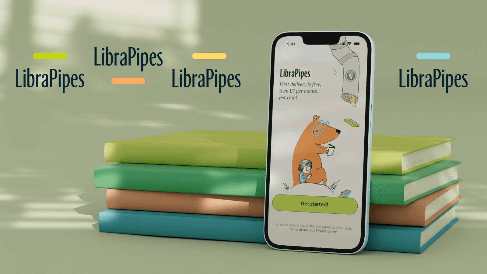
I invented LibraPipes for my son Maxwell who loves reading, and for other children as well. Since Maxwell was a toddler, I have spent a lot of money, time and efforts buying children books, borrowing them from the library, and figuring out which books are right for him.
LibraPipe's mission
LibraPipes's mission is to provide children with new books regularly, with no effort from parents. The service delivers carefully selected books from local libraries and collect them back, saving parents time, money and home space.
Process
UX Research (user interviews, survey and competitor analysis)
Docs, flowmaps and wireframes
Design concept
Visual design of all screens in Figma
UI kit
Summary from UX Research
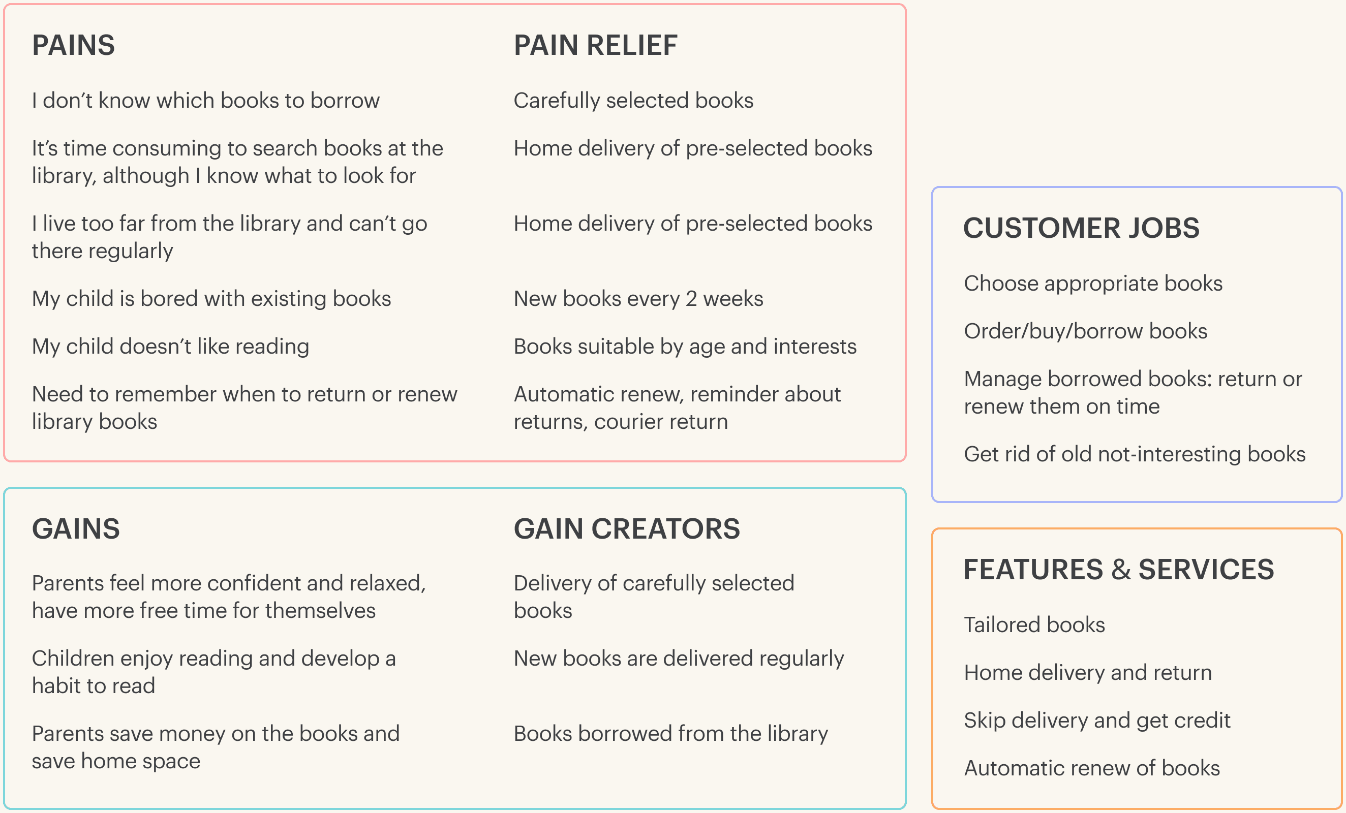
I conducted 6 interviews with parents to understand their habits and challenges associated with reading. I also launched a survey to learn how often and how much they spend on new books.
Design concept:
cute, warm and old-fashioned
I wanted the app to be cute, warm and old-fashioned. I conveyed these values through:
A combination of fonts to create informal and easy vibe
A warm bright colour palette
Simple cute illustrations in a childlike manner
Product stages and goals
I set some stages and goals for the first 6 months of LibraPipes.
Stage 1. The first 500 parents to install the app and receive their first free delivery.
Stage 2. Convert 70% of those initial users into subscribers.
Stage 3. Establish healthy and stable loops of delivery and collection.
Stage 4. Retain subscribers for at least 6 months.
Easy quick onboarding
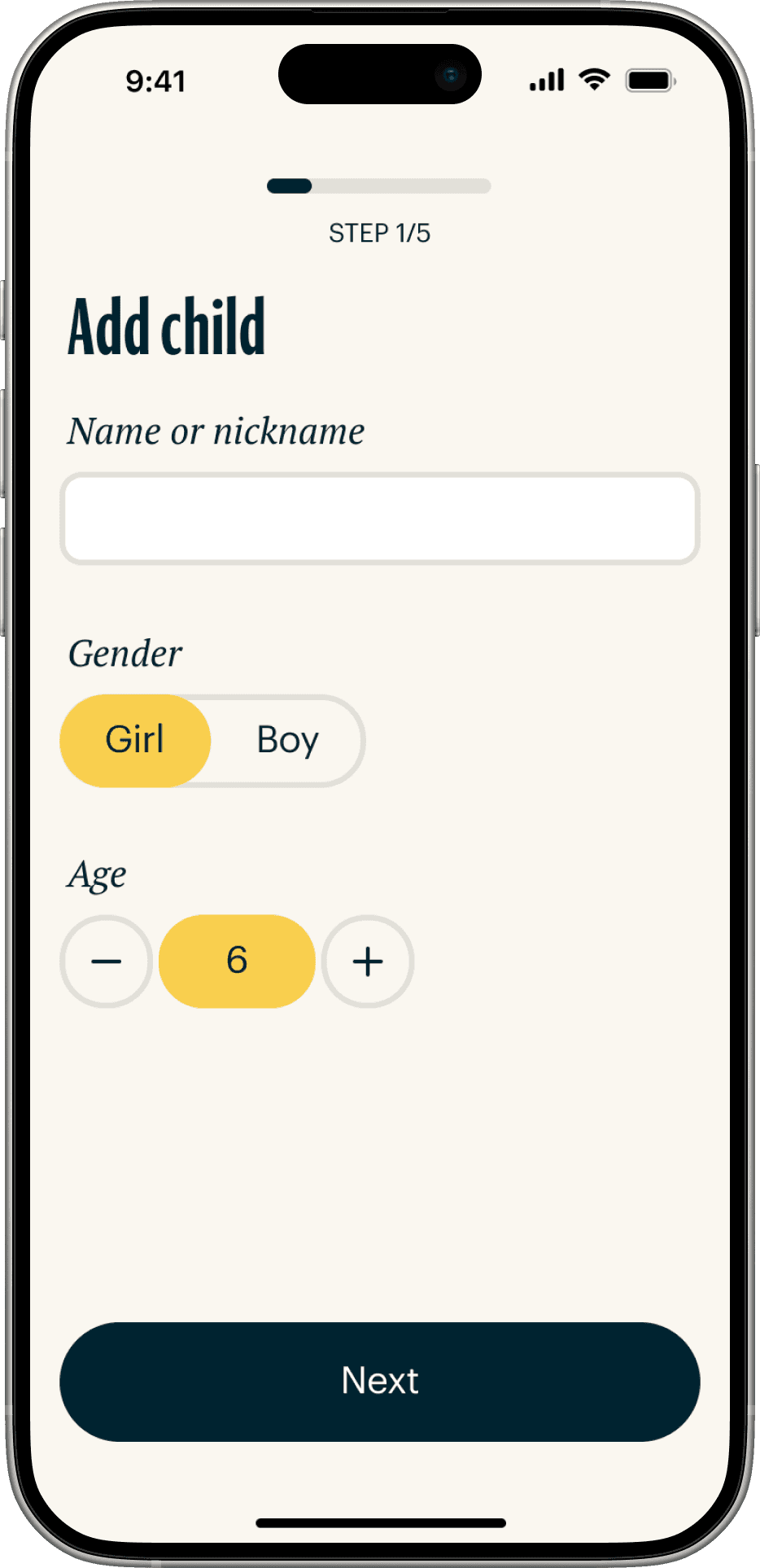
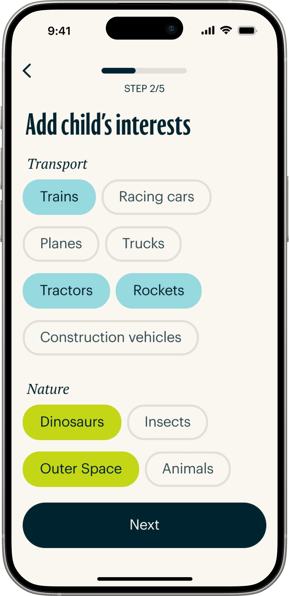
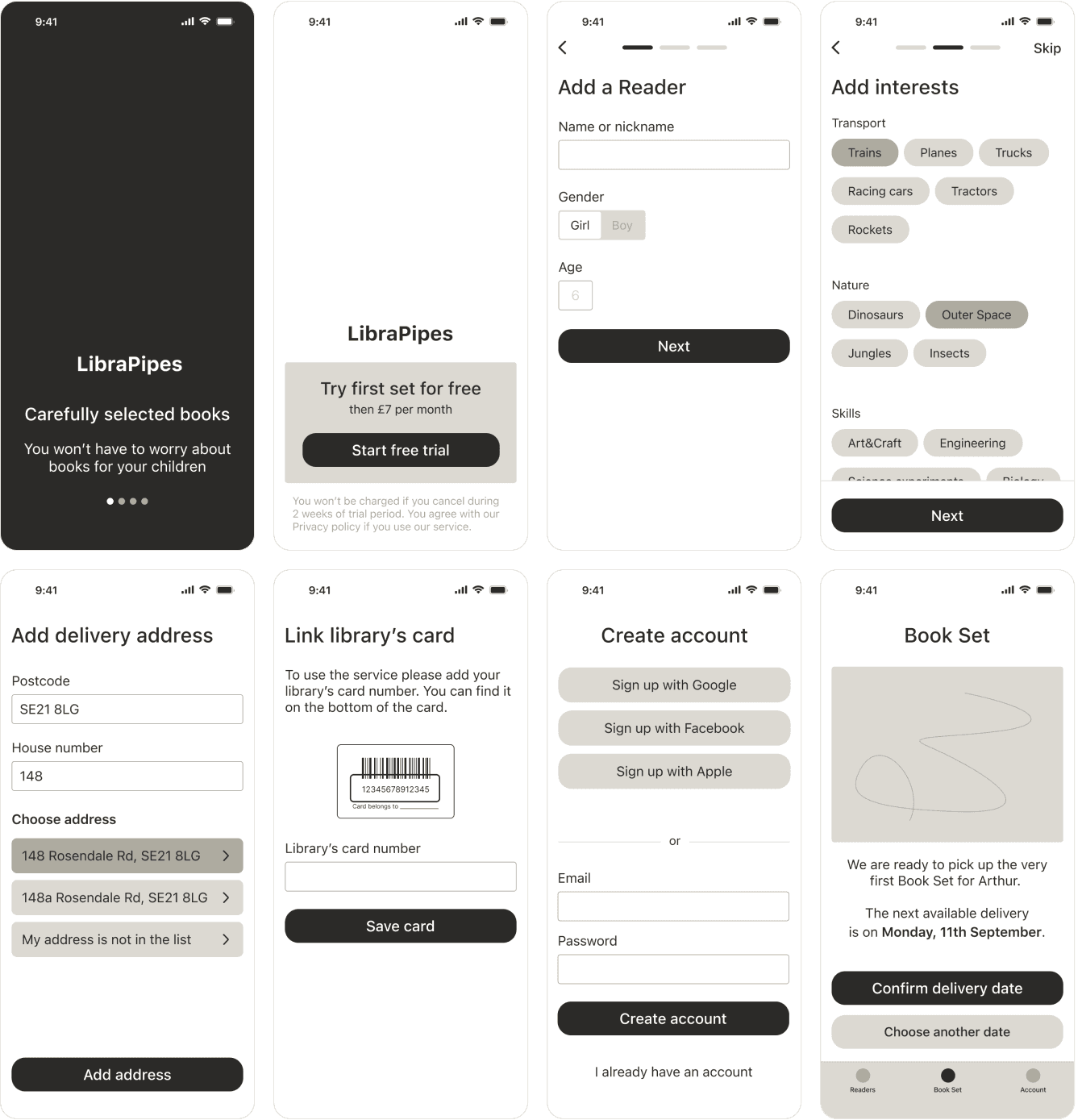
Onboarding process is in the focus at the Stage 1. Onboarding begins with creating a child's profile and ends with creating an account. Fun things first!

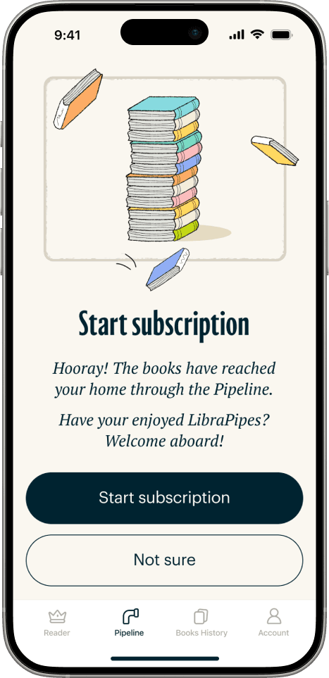
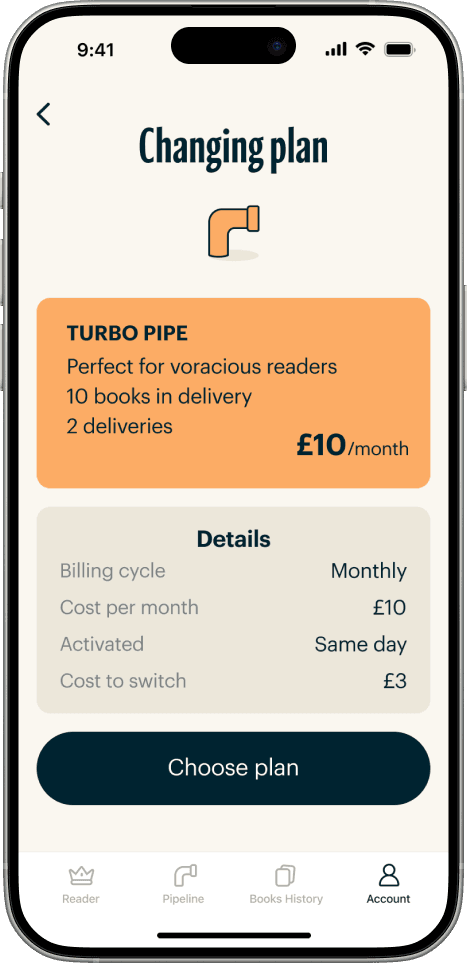
Conversion into subscription
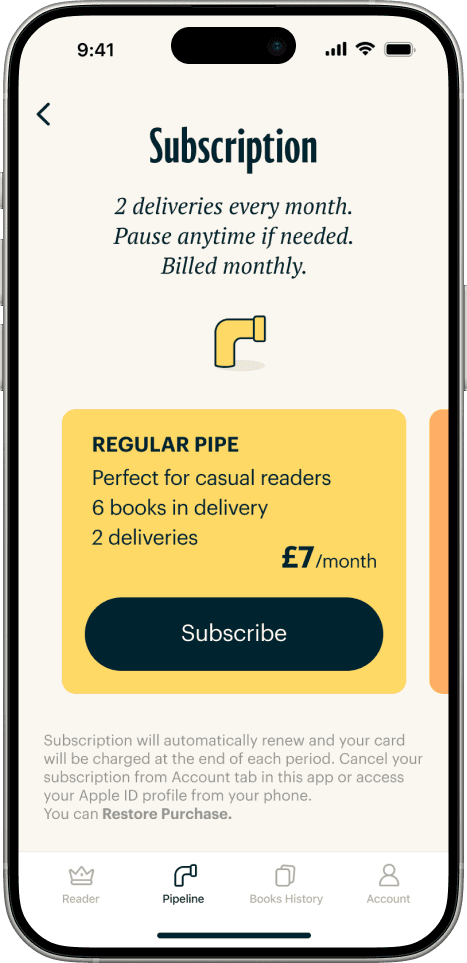
Conversion into subscription is in the focus of Stage 2.
To help reach high conversion rate I used:
Clear text labels
Colour-coded plans
1-click subscription
Also collect data why users don’t subscribe
Navigation: Pipeline section
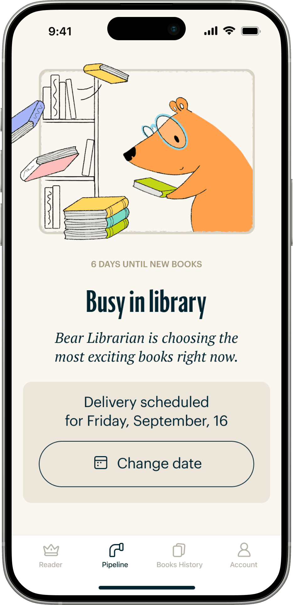
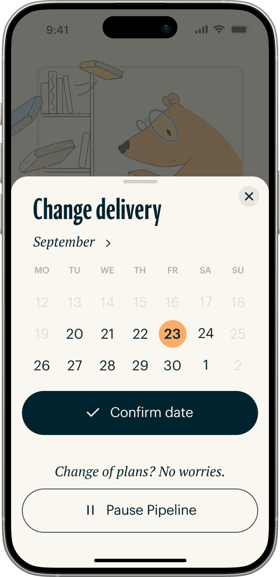
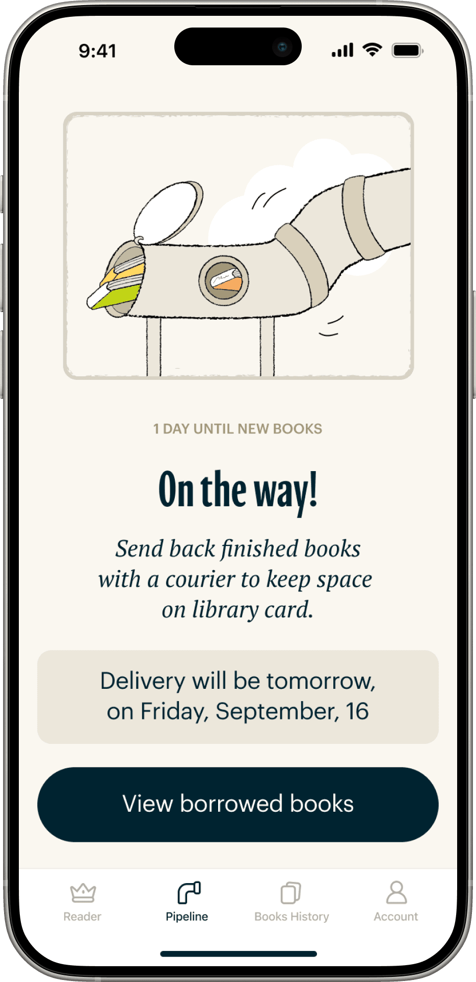
Let's explore LibraPipe. It has 4 main section in navigation. Pipeline section shows parents information about delivery:
It's time to schedule a new delivery
Books are ready for delivery
Books have been delivered
Pipeline paused
Library card is full
Parents can schedule a delivery in 2 clicks!
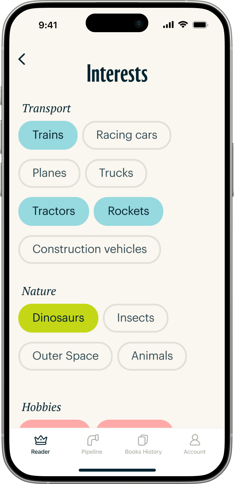
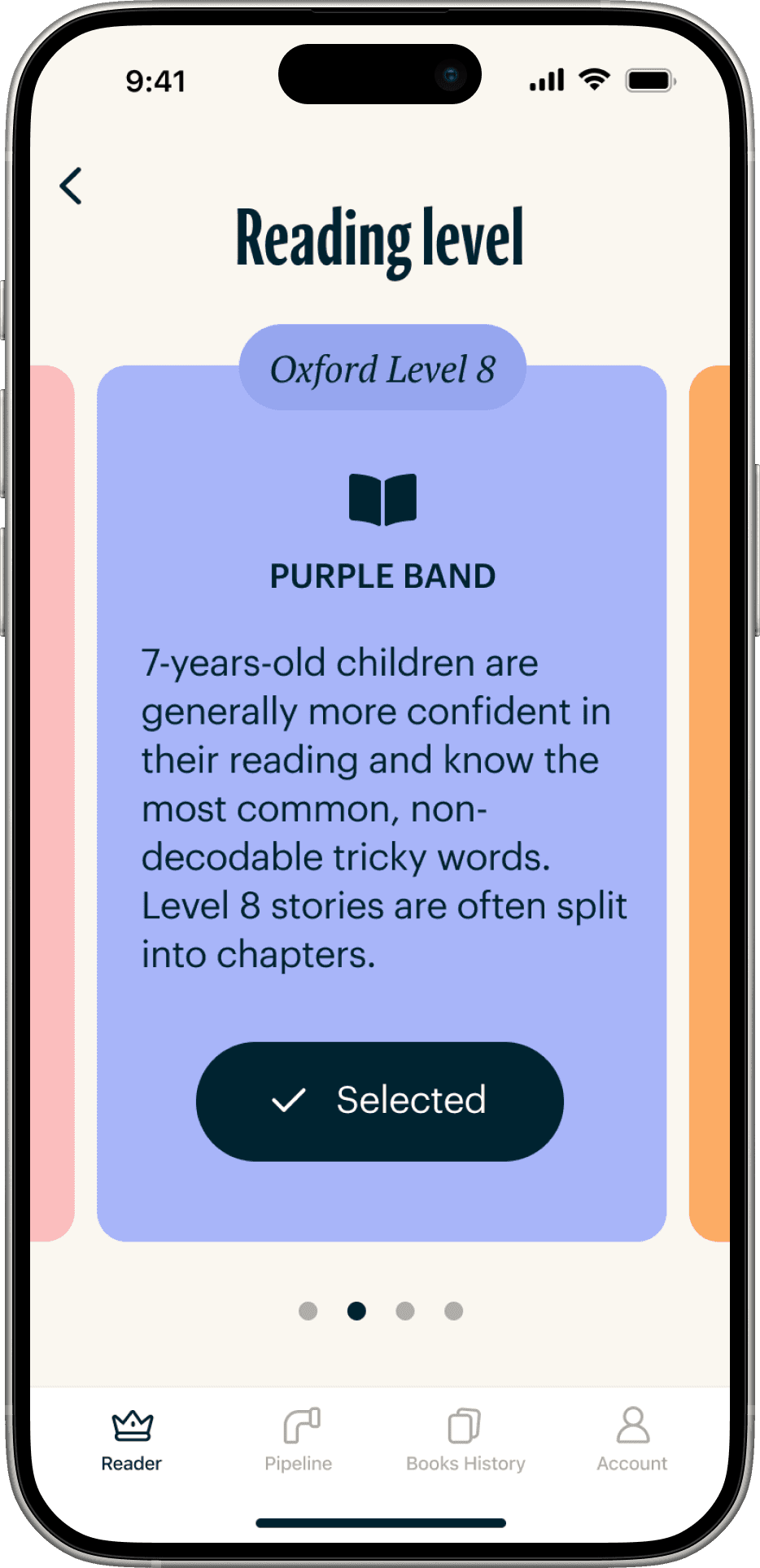
Carefully selected books
Carefully selected books are essential for LibraPipes’ success. This is possible due to the ability to choose interests and reading levels.

Books History
Books History section helps parents to keep track of borrowed books and recall books that their children loved. Books History is in focus in Stage 3.

Account and subscription
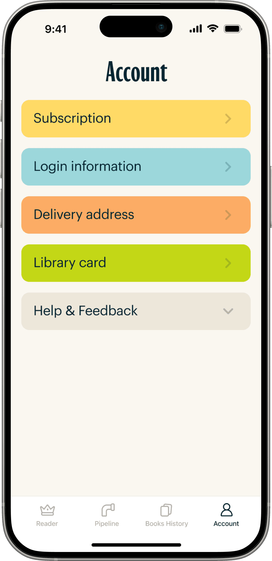
Account section helps parent to update delivery information or library card. The section is consistent with other screens.

Retention rate: adding secret messages
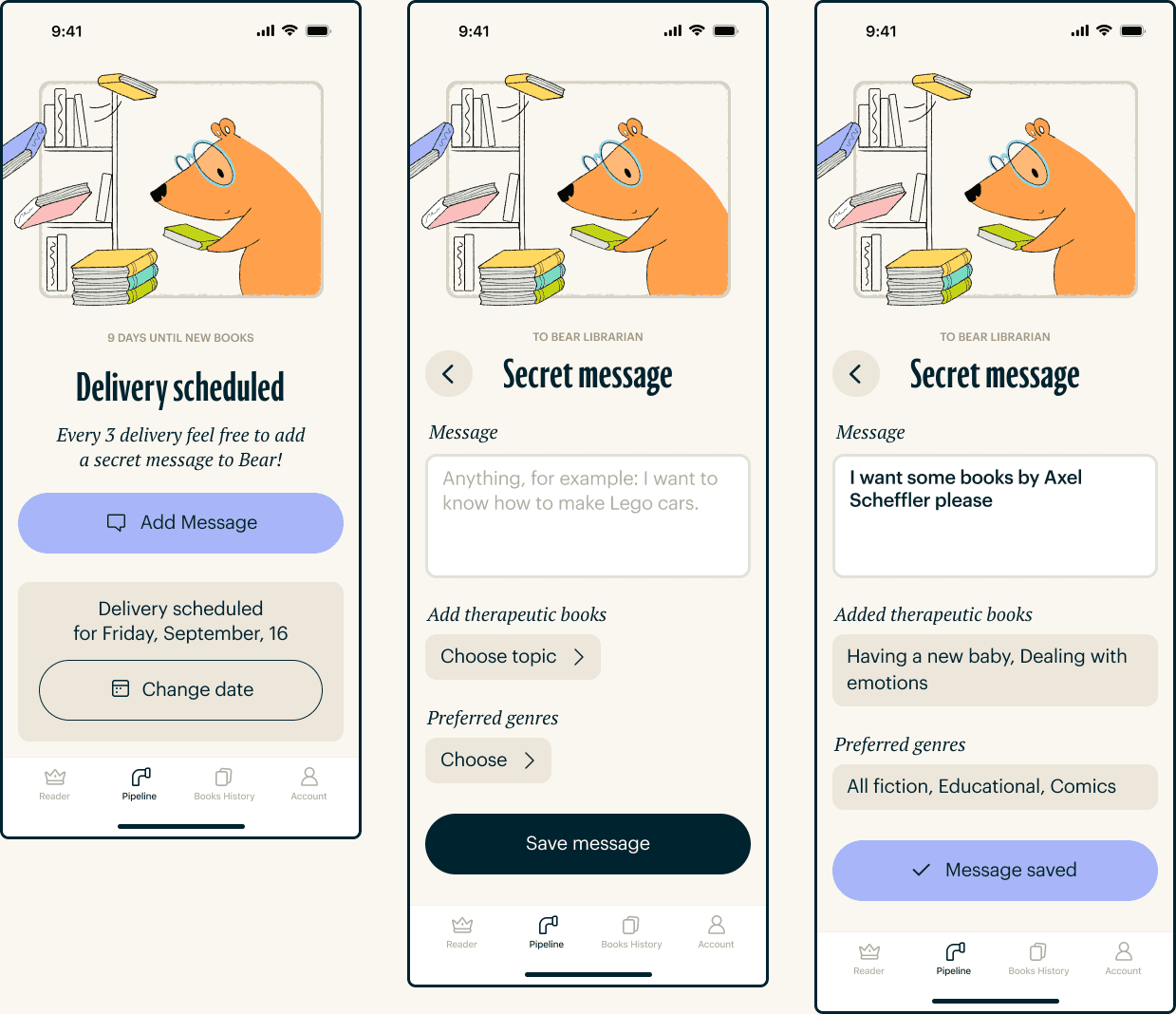
To increase the retention rate, I implemented variable rewards, offering special benefits for every third delivery. This includes a message to the curator about preferred genres, illustrators, etc. Free perks are also included every 2 months.
LibraPoints are awarded with each delivery. The app's language is informal and fun, which also helps increase retention. All special benefits are color-coded for easy recognition and marketing.
Example of onboaring flow wireframes
Results
LibraPipe service meets the needs of parents.
The screens are structured and user-friendly, making it easy for parents to understand how the app works and navigate it effortlessly. Parents appreciate that the app is effective without requiring too much from them.
LibraPipe successfully conveys values: Cute, Warm and Old-fashioned through colours, illustration and typography.
I proposed stages and metrics for the team to focus on, as well as measures to increase the retention rate.
The design is consistent, and the Figma file is ready for development, complete with all variables and components.
